Financial interfaces pack dense numbers, tight tables, and time-sensitive alerts into small screens. If your text styles are inconsistent or poorly scaled, users miss decimal points, misread balances, or abandon the flow. An advanced typography system for figma ui kits in finance sector solves this by standardizing how every label, heading, and data point behaves across breakpoints, themes, and components. It is not about picking a decorative font. It is about building a predictable text architecture that keeps numeric columns aligned, visual hierarchies clear, and developer handoff straightforward.
What makes a typography system advanced for finance UI kits?
Most starter kits stop at three heading sizes and a single body style. Finance products need more granularity. An advanced setup tracks tabular figures for currency, fixed-width monospace options for transaction IDs, distinct styles for positive and negative values, and micro-labels for chart axes. It also locks in line heights, letter spacing, and paragraph spacing so a pricing card looks identical on a mobile banking app and a desktop trading terminal. You can see how this structure comes together when you review the layout rules in our Figma typography documentation for finance kits.
When should you upgrade your Figma text styles for financial dashboards?
You will notice the need when your design file contains duplicate text styles, developers ask which font weight applies to secondary metrics, or your dark mode version makes light gray text disappear. If your team ships weekly updates for a wallet app, brokerage platform, or accounting tool, inconsistent typography slows down reviews and increases QA bugs. Upgrading your type system early prevents rework later. Teams that plan enterprise rollouts often pair their base styles with tested pairings, which you can explore further in our notes on typography combinations for enterprise applications.
How do you structure type scales for banking and trading interfaces?
Financial screens rely on predictable spacing. Start with a modular scale that matches your layout grid. A 1.25 ratio works well for dashboards because it keeps jumps between sizes subtle. Map your styles to clear roles: page title, section header, card title, primary metric, secondary metric, body, caption, and axis label. Set line heights to multiples of 4px so they align with your spacing system. Use tabular numbers for all monetary values and percentages. If you support dark themes, adjust contrast and weight rather than just inverting colors. The approach we use for typography scales in dark mode themes shows how slight weight shifts keep readability intact without blowing out the background.
Which font pairings actually work for dense financial data?
You do not need five typefaces. Two are enough. Pick a highly legible sans-serif for UI labels and navigation, then pair it with a monospace or a sans-serif that supports true tabular figures for data tables. Fonts like Inter handle interface text cleanly, while a dedicated monospace keeps transaction hashes and ledger entries aligned. Test your pairing at 12px, 14px, and 16px. If the x-height drops too low or the counters close up at small sizes, swap it out. Finance users read numbers faster when character widths stay consistent and decimal points line up vertically.
What common mistakes break readability in finance apps?
Designers often overlook small details that cause real friction. Using proportional numbers in pricing tables makes columns jitter. Setting line height to auto breaks vertical rhythm when text wraps. Relying on font weight alone to show hierarchy fails when users enable high-contrast mode. Another frequent error is creating separate text styles for every component instead of reusing a shared scale. This bloats the Figma file and confuses developers during handoff. Keep your style names role-based, not component-based. Name them like Body / Regular / Default instead of Card / Text / V2.
How do you set up your Figma file for clean developer handoff?
Build your text styles in a dedicated library file. Use Figma variables for light and dark themes, and bind your typography tokens to those modes. Group styles by category and add short descriptions that explain where each style belongs. Turn on clip content for icon labels only when necessary, and avoid nesting text inside auto-layout frames with conflicting padding rules. Publish the library, link it to your product files, and run a quick audit with a plugin that flags unused styles. When developers inspect a frame, they should see one clear text style, one line height value, and a predictable spacing pattern.
- Audit your current text styles and delete duplicates
- Switch all monetary and percentage fields to tabular numbers
- Lock line heights to 4px increments that match your layout grid
- Create role-based style names and add usage notes in Figma
- Test your scale at 12px, 14px, and 16px in both light and dark modes
- Hand off a single typography library file with mode variables enabled
 Essential Font Hierarchy Principles for Enterprise Figma Ui Kits
 Enterprise Figma Typography Kit Combinations
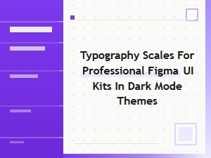 The Typography Scale for Dark Mode Ui Kits
 Cinematic Typography with Figma Display Styles
 Creative Display Fonts for Luxury Figma Kits
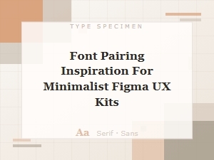 Font Pairings for Minimalist Figma Ux Kits