Picking the right typeface for a minimalist Figma UI kit isn’t about chasing trends. It’s about removing visual noise so users can read, scan, and tap without friction. When you strip away heavy backgrounds, decorative dividers, and complex gradients, the text carries most of the interface weight. A poorly chosen font will make even the cleanest layout feel cluttered or hard to navigate, while a well-matched family keeps the design quiet and functional.
What makes a typeface work for clean interface design?
Minimal interfaces rely on spacing, hierarchy, and consistent weights instead of visual embellishment. A solid UI font needs clear letterforms, open apertures, and multiple weights that actually look distinct on screen. You want a family that renders sharply at 12px for captions and stays legible at 14px for body text. Sans-serif families usually win here because they avoid extra strokes that blur on standard displays. If you are building a design system from scratch, you can see how type selection shapes the entire visual rhythm before you ever add color or iconography.
Which type families actually fit a stripped-down layout?
You do not need a massive library to build a functional kit. Stick to families that offer regular, medium, and semi-bold weights, plus italic styles if your content requires emphasis. Inter works well for dashboards because its tall x-height keeps small text readable. DM Sans gives a slightly softer feel for consumer apps, while Manrope handles numeric data cleanly thanks to its built-in tabular figures. When you map these to your components, you will notice how matching type to buttons, cards, and input fields reduces the need for extra borders or drop shadows.
Where do designers usually go wrong with UI typography?
The most common mistake is adding too many weights or mixing unrelated families. A minimalist kit only needs three to four weights maximum. Using light or thin styles for body text creates contrast failures on standard monitors. Another frequent issue is ignoring line height. Tight leading makes paragraphs feel dense, while excessive spacing breaks the visual connection between headings and supporting text. Designers also forget to set up text styles in Figma early, which leads to manual overrides that break when components update. You can avoid most of these problems by defining your baseline typography rules before building reusable frames.
How do you set up a scalable type scale in Figma?
Start with a base size, usually 16px for web layouts or 14px for mobile interfaces. Multiply by a consistent ratio like 1.25 or 1.333 to generate your heading sizes. Name your text styles by function, not by pixel value. Use labels like body/regular, caption/muted, and heading/lg so your team understands the purpose behind each style. Turn on auto layout for every text layer so padding adjusts when content changes. Check contrast ratios against your background colors, and test your scale on an actual device preview instead of relying solely on the Figma canvas.
What should you verify before publishing your kit?
Run through a quick audit before you share the file with developers or other designers. Verify that every text layer uses a published style. Remove any unused font weights from the file to keep it lightweight. Test long strings, special characters, and numbers to catch overflow or spacing issues. Make sure your type scale aligns with your spacing system, typically using 4px or 8px increments. If you follow these steps, your typography will hold up across different screen sizes and content lengths.
Quick checklist before you hand off your Figma kit:
- Limit the family to three or four weights that pass WCAG contrast at small sizes
- Name text styles by role instead of pixel values
- Set line height to 1.4–1.6 for body text and 1.2–1.3 for headings
- Enable auto layout on all text containers
- Test with real product copy, not placeholder lorem ipsum
- Remove unused font files and detach orphaned overrides
Pick one type family, build your base styles, and test them on a live mobile preview. Adjust spacing until the hierarchy reads clearly without extra decoration, then publish your styles for the rest of your team.
Explore Design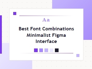 The Best Minimalist Font Pairs for Figma Interfaces
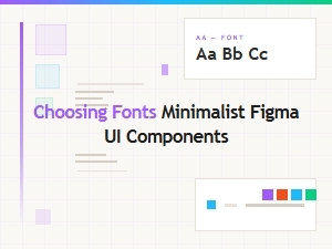 Choosing Fonts for Minimalist Figma Ui Components
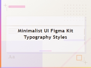 Essential Typography Styles for Minimalist Ui Kits
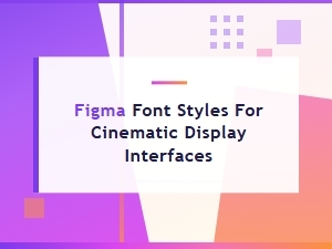 Cinematic Typography with Figma Display Styles
 Essential Font Hierarchy Principles for Enterprise Figma Ui Kits
 Creative Display Fonts for Luxury Figma Kits